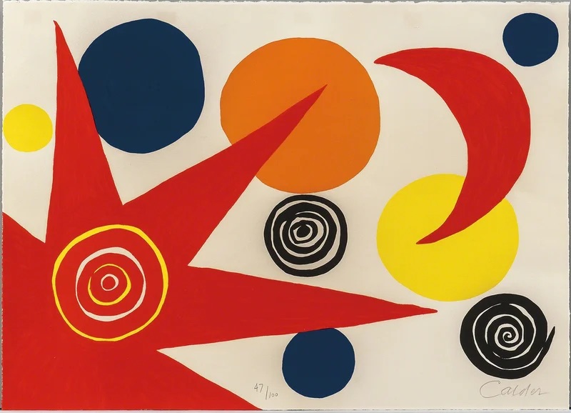

Alexander Calder is best known for his mobiles, but his gouache paintings on paper reveal the same sensibility working in two dimensions: color used as a physical, moving thing rather than a static fill. Calder worked almost entirely in flat, unmixed color — red, black, yellow, blue, set against raw white paper — and let shapes float, overlap, and counterbalance each other the way his hanging sculptures balance in space.
For design students, Calder’s gouaches are a useful case study in color play as composition: color blocks aren’t decorating a shape, they are the shape, and their weight, size, and placement against the white ground do the same work that mass and counterweight do in his mobiles. It’s a good prompt for thinking about color relationships as active and structural, not applied after the fact.


